Reporting for Confluence Cloud
This case study details the re-design I did for Reporting (Confluence Cloud). As a product built from engineering team alone, it gave me the chance to show how improved user experience and impact an application not just for users, but also bring structure to code.
OPPORTUNITY STATEMENT
Confluence stores data that can be transformed into insights, but users need a way to engage with them. Reporting helps users capture this data and create reports.
A re-design of this app consisted on understanding user needs, technical literacy of the every-day user, interaction design and building rule engines.
MY ROLE
UX/UI Designer, product direction, User research, facilitator, prototyping, wireframes, user testing, user flows and persona mapping
ACHIEVEMENTS
1K+ installs
Delivered a new interface alongside re-imagining of rule engines
Redefined design process within engineering sprints (driving weekly sprints based on deliverable and value adding outcomes, integrating design tickets into the backlog)
Why?
We moved Reporting from Server/DC to Confluence Cloud to keep offering the same benefits to users. Unfortunately, the Cloud version didn't connect well with users, resulting in poor engagement, fewer installations, and more complaints.
When I joined the team for a redesign, I quickly spotted various ways to improve the user experience and user interface. But then I realized I needed to pause, step back, and assess the situation more broadly.
What exactly was lacking?
Why did our expectations fall short?
Even though existing customers from DC/Server were installing the Cloud version, why weren't we attracting many new customers?
How?
Designing a successful product requires balancing feasibility, viability, and desirability. I had to consider all three factors when building the latest version of Reporting for Confluence Cloud.
A number of factors changed and impacted how we would look at the app across these factors:
Feedback from users
Deadline of DC sunset prompting action
Atlassian Data Analytics released - a powerful, native tool that gathered Confluence metadata
Different team working on the product
Challenges
-
The first version of the app was built very quickly. A lot of quality and polishing was overlooked in favour of a quick release
-
There is a fundamental difference between DC/Server and Cloud - not only what they provide the customers, but also in how the frameworks are employed and built. A number of popular features in the Server version were unable to be replicated by Cloud
-
There was no clear marketing or messaging as to what the user could expect from the app at the time, with many old users jumping in and expecting the same tool without warning.
-
Translating some of the key features in a 1:1 mapping with the Cloud framework was difficult technically, and squad members who had experienced this before were reluctant to make large changes. ‘If it’s not broken, why fix it?’ mentality.
-
The sheer flexibility of the app was a result from it relying on JQL to fetch data. With limited knowledge on how this language worked, I had to learn it alongside my research Item description
Research.
Zoom
Maze
Mixpanel
Tools used
Heuristics evaluation
Competitive analysis
User interview
Research
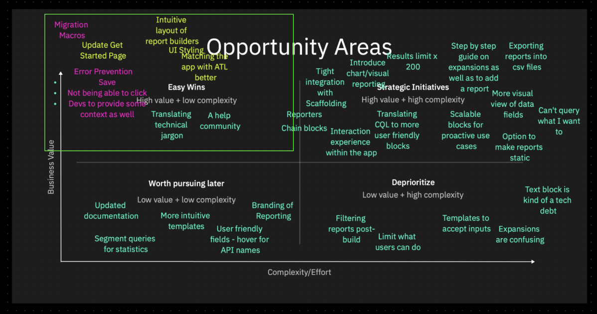
Research enables us to identify opportunities and weigh them to see what can be prioritised.
The (grand) designs.
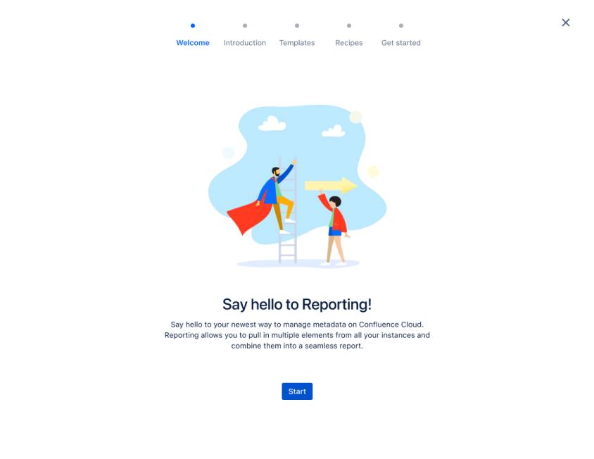
Onboarding
A way to introduce new and existing users to the app, intuitive and interactive design that helps simplify a complex app.
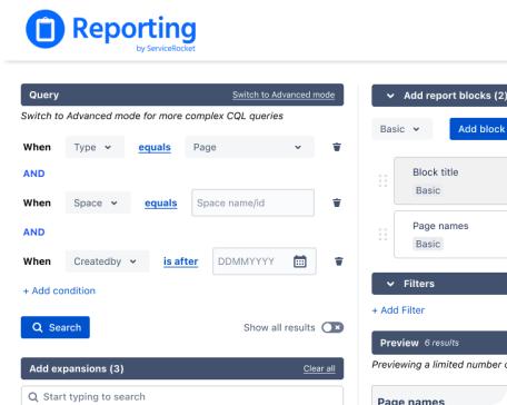
Query experience
Introduced a new form of query experience 'Basic search’ allowing users to use drop-downs and autofill to facilitate a better search
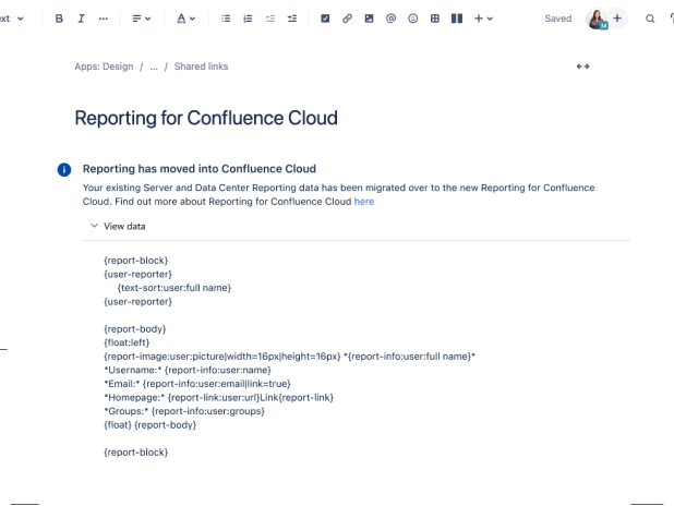
Migration
Taking care of our users who are moving from the DC/Server version through clear and sufficient information
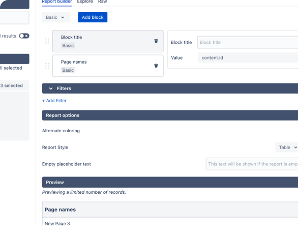
Transition Approach
We also introduced a transition approach to slowly introduce the new features to our customers
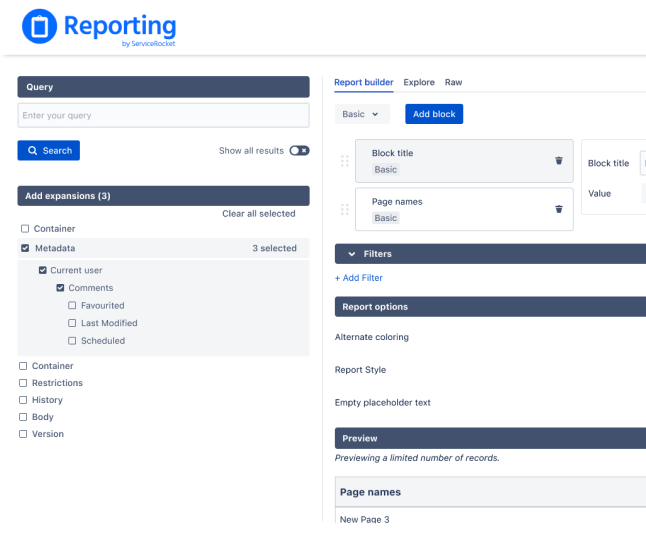
Highlighting feedback
Ensuring users always has system feedback through use of numbers to indicate selected and blocks used/displayed
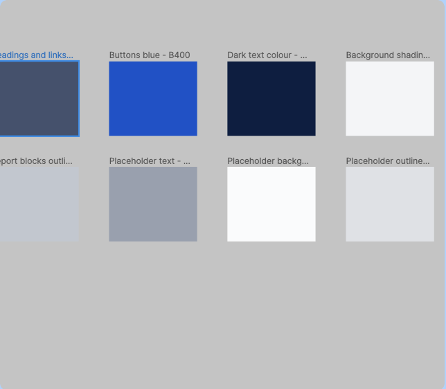
Typography and Colour
To keep the app consistent and give it a more polished look and feel, I standardised the colours and type we used
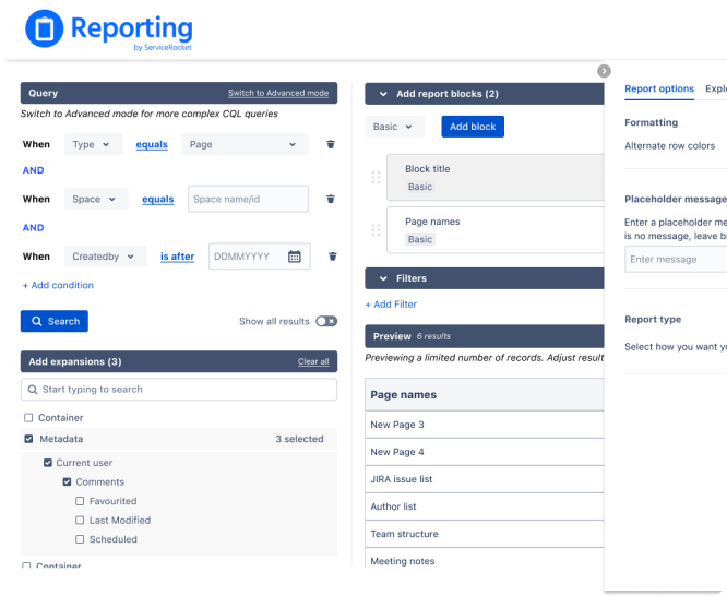
Considering all real estate
Redesigned the entire layout of the app in a hierarchical way. Ensured actions that are similar group together
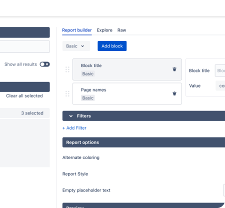
Multiple other UI changes
Throughout the layout and re-design I also adjusted multiple other UI elements smooth out the UX and UI.
IMPACT - The re-design took roughly 6 months and it was slowly rolled out to our users over a few different phases. Each phase consisted of an email marketing plan, small changes in the code and platform, and updated documentation. This was because we didn’t want to overwhelm the users with multiple changes to the app at the same time, given it was already a complicated application.
The installations increased by 120% as presented by the Atlassian Marketplace data. For areas which we addressed, we saw the number of calls going to support decrease. Speaking to recently installed users, we also found that an increasing number of them did not have technical backgrounds, showing we were able to reach more people.
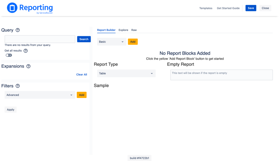
Before
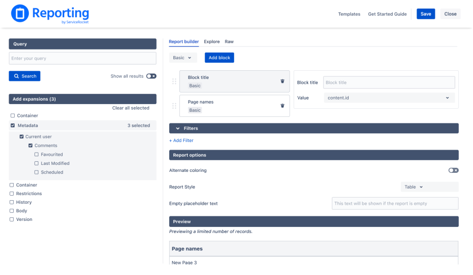
After
Retrospective
This project was complicated and multi-faceted, and I was lucky to have been able to experience the different challenges I did and overcome them. I found that working closely with my squad from the early research stages was very important, and was thankful to a lot of the suggestions especially early on when I hadn’t developed my JQL knowledge yet.
It was also a lesson in understanding not just the design aspect - but the business aspect of a product too. I worked closely with my PM to understand how the now ecosystem was impacting our vision for the product, and to pivot towards creating an app that would remain relevant.